
PowerPoint accessibility guide
- Use the built-in accessibility assistant
- Title your slides and use headers
- Make the right choices for your text
- Check the colour contrast and colour use
- Add alt text, or mark images decorative
- Don’t clutter the slides
- Clearly and uniquely identify your links
1. Use the built-in accessibility assistant
This tool is a built-in algorithm that checks your work against digital accessibility standards. You can turn this on, and have it alert you to common accessibility issues that arise while you are working – or you can run it once you are done, to find anything you may have missed.
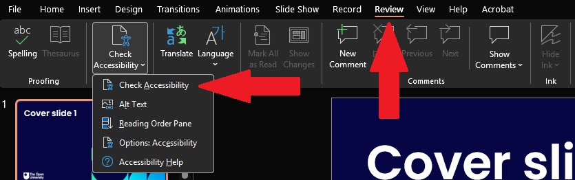
The checker can be found in the navigation ribbon under ‘Review’ > ‘Check Accessibility’. From the options in the drop-down menu, select ‘Check Accessibility’ and it will run an automatic check for you.
The results of this check will open in the Accessibility Assistant pane. It will list any issues it finds, such as missing alt text, poor colour contrast, and missing slide titles. All you need to do is select each issue and follow the instructions provided to fix it.
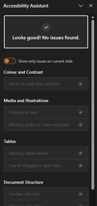
This checker is not perfect, though, so you should always do a manual check of your slides as well.
We encourage you to use this every time you create a document, as default.
Microsoft Support: Make your PowerPoint presentations accessible to people with disabilities
Microsoft Support: Improve accessibility in your documents with the Accessibility Assistant
2. Title your slides and use headers
Every slide in your presentation should have a (relatively short) unique title.
Having short, unique titles, will help screen reader users navigate the presentation. The short titles mean that they can listen to the list of them, to get an understanding of the whole presentation, and they can select from that list to jump to a particular slide more easily.
Good slide titles also help everyone understand your work better.
When writing your titles, you should make them as useful as you can. They should provide context for what people will find on the slide. Instead of using titles like:
- Report
- More information
- Part 2
You should use something like:
- Survey results: use of online tutorials
- [Topic] additional resources
- Part 2: Comparing theories
If you are using multiple slides to cover the same subject, title the slides in a way that makes this clear, for example:
- Survey Findings: shopping habits
- Survey Findings: shopping support
- Survey Findings: data table
Slide titles are something that the accessibility checker will pick up on. For example, it will alert you if you accidentally use the same title on multiple slides, or if you forget to add a title at all.
You should do the same for the content headers within each slide, especially if you cover multiple topics on the same slide. Content/topic headers should be useful and make it clear what the following text is about.
Unlike Word, there are no heading styles to use in PowerPoint, so your topic headers will have no semantic information for assistive technology users. In your slides, the headers will be visual only.
You should put your section headers in a larger and bold font, making it visually clear that they are the topic headers.
Microsoft Support: Title a slide
3. Make the right choices for your text
You never know exactly what size screen or projection your slides will be viewed on, so you need to make sure that the text is as readable as possible. To do this you need to use larger text than you might be used to. Aim for 15pt or larger for the main content, and 20pt or larger for titles and topic headers.
For the font, you need to use one that is built for readability; this means using common, sans-serif fonts, such as Arial, Calibri, or Aptos. These fonts are clear, the letters are easy to distinguish, and they are used often enough that people are used to seeing them.
Additionally:
- Always align your main text content to the left, as this will avoid common issues for dyslexic readers.
- Avoid using bold and italics too much, you should use these only to emphasise specific words or short phrases.
- Use shorter sentences, giving the most important headline information.
- Use bullet points where possible, instead of filling the slide with too much information.
- Do not use underline anywhere, as underlines are used to help identify links.
Microsoft Support: Change the fonts in a presentation
Microsoft Support: Change text alignment, indentation, and spacing in PowerPoint
4. Check the colour contrast and colour use
Colour contrast is especially important for people who are colour blind, or who have poor vision. The wrong contrast could make an otherwise well-made slide very hard or even impossible for someone to read.
Essentially, make sure that all your text is dark, and your backgrounds are light, so the contrast is strong. Black text on a white background might be too strong for some viewers, so try using dark blue text or dark grey text instead. Do this for icons and arrows/lines as well.
Layering text over an image can cause issues for readers as well, as the shapes, colours, and patterns in the image can make the text hard to see and hard to read. You should avoid doing this unless strictly necessary, and if you do, place a colour block between the image and the text.
Think about the colours you use in your graphs and charts, as these especially need to have good contrast so they can be understood by everyone. You should also label each part clearly and not rely on colour alone to identify anything. For example, using ‘red’ to mean ‘incorrect’ and ‘green’ to mean ‘correct’ without also adding text labels will mean nothing to a red/green colour-blind viewer.
The Accessibility Assistant will pick up on colour contrast issues, so make sure that you use it. However, it is not very good at picking up text-over-images so you will need to make sure you haven't accidentally created hard to read text in this way, by checking through the presentation yourself.
Microsoft Support: Video: Use more accessible colors and styles in slides
5. Add alt text, or mark images decorative
Alt text should be a single sentence around 150 characters long (including the spaces between words!) and provide the most necessary information for those who can’t see the image to still fully understand it.
There are three types of images:
- Necessary/Informative
- Decorative
- Complex
Necessary
Every image deemed necessary/informative must be given a text alternative (alt text).
To add alt text, simply right click on the image, and select ‘View/Edit Alt Text’. The alt text editor pane will open (usually to the right of the screen.) In the text box in the edit pane, add your short description.
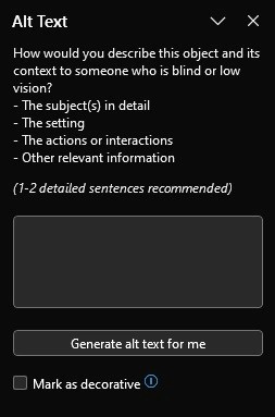
The alt text box may already have an AI Generated sample text description in it. These are often incorrect or unhelpful; it is best to delete it and write your own. Generally, it is better for the content creator/author to write the alt text, as they will understand what the image is meant to be expressing.
An example of good alt text is: ‘The Mona Lisa, an oil portrait of a gently smiling woman sitting before a dusky landscape.’
Decorative
If the image is purely decorative, or ‘eye candy’, or it’s an element such as shapes, arrows, or icons, then it should be marked as decorative. To do this, you simply select the ‘mark as decorative’ check box that sits underneath the text box.
It is worth giving some thought to whether a decorative image might need alt text anyway, so screen reader users get an equal experience to sighted viewers – like joke images/memes.
Note: There is an ongoing issue with the ‘decorative’ marker, that screen readers still pick the image up and announce: ‘decorative, image, inline with text’.
Complex
Complex images, such as images of diagrams, charts, and graphs, will need what is called a ‘long description’. For PowerPoint this means you should put the image on a slide of its own, and include the long description next to, or beneath it.
A long description should be a clear, concise, no-frills relaying of the most important information/data from the diagram, graph, or chart. If the information can be put into a table format, then consider doing this and placing the table on the same slide as the diagram, graph, or chart instead of a long description.
Microsoft Support: Everything you need to know to write effective alt text
6. Don’t clutter the slides
There is a temptation to decorate PowerPoint slides with images, clipart, and other such elements. Avoid doing this, instead you should prefer simple layouts that are clear and easy to understand.
Use colour consistently across the whole deck – stick to two or three colours at most, and be mindful where you put them and how you use them.
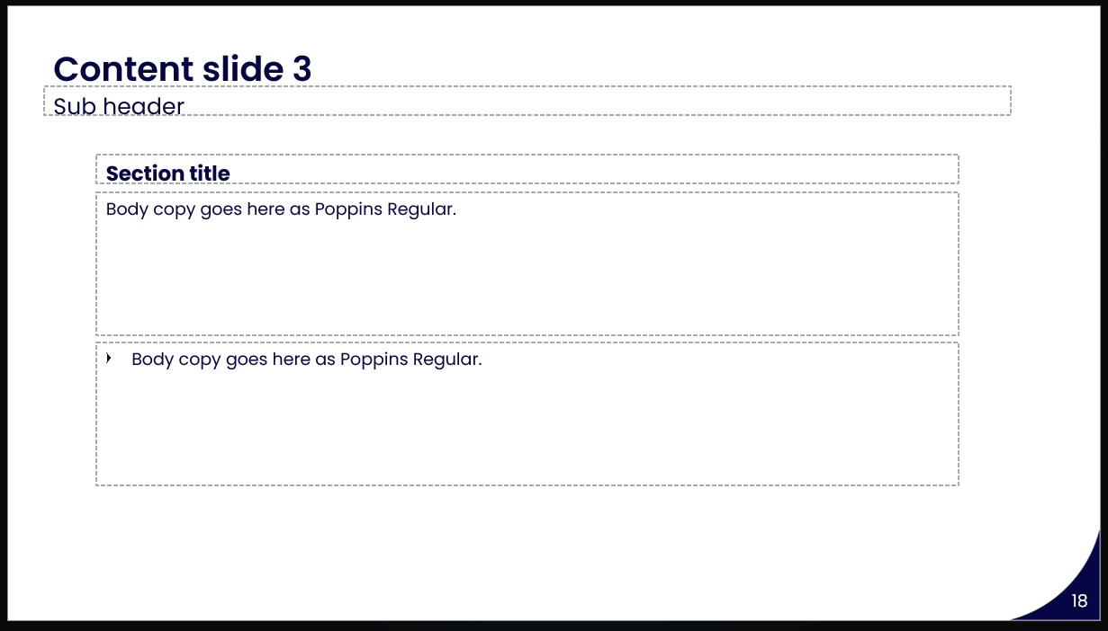
Your slide decks will come with place holder boxes already on them. We encourage you to use these, instead of adding new text boxes. New text boxes are harder for assistive technologies to access, so using the existing placeholder boxes will make your content more reliably accessible.
While you can move the placeholder boxes around, and make them bigger or smaller as needed, you should always try to space them out so that they are not too close together. Being too close together will make them harder to read.
- Focus on one main idea per slide
- Leave space around text and images
- Avoid large blocks of text
- Keep items aligned
- Use a consistent layout throughout the presentation
- Use multiple slides rather than squeezing in too much information on a single slide
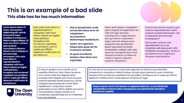
These things help not only your average reader, but they are important to make content accessible for many neurodivergent readers.
Equally, while PowerPoint allows you to add animations to your slides, and to add animated transitions between your slides, you should avoid using them. Certain animations and transitions may present problems for visually impaired viewers, neurodivergent viewers, and viewers who have photosensitive epilepsy.
7. Clearly and uniquely identify your links
When adding links to your slides, you should make sure that the purpose and destination of the link is immediately clear. This should be done whether you are listing links, or you are adding a link within the text content.
To prevent confusion and give readers a clear understanding of what the link is for:
- Links should be informative
- Do not use ‘Read More’ or ‘Here’ or ‘Link’, as these do not tell the user what the link is, or where it will take them.
- Links should be unique:
- Do not use the same text for a link more than once in a document, unless each link goes to the same place.
- Using the same text for multiple links can confuse screen reader users, who will not know which link they should activate or jump to.
- If your slide deck is just for a presentation, and won’t be shared, place the URL for the link after the link, and read it out loud for your audience.
Microsoft Support: Add a hyperlink to a slide


Explore

Undergraduate
Postgraduate
Policy
-
Follow us on Social media
-


